
Tutorial Details
- Software: Adobe Illustrator
- Difficulty: Intermediate
Download Source Files
Final Product What You'll Be Creating

In this tutorial, we’ll be creating a poster with a strong geometric central design, which utilizes flowing blends, masks shapes, and subtle gradients, to create a sophisticated final work. Learn each detailed step in creating this poster. Let’s get started!
Step 1
First, we’ll prepare the document and swatches. Create a new US Letter sized document using RGB mode (located under the Advanced options). I have five color swatches prepared in my Swatch palette to be used for my illustration:
- Bright Green: R=199, G=255, B=0
- Blue: R=121, G=255, B=255
- Hot Pink: R=255, G=0, B=139
- Orange: R=255, G=147, B=0
- Dark Grey: R=50, G=53, B=56
Step 2
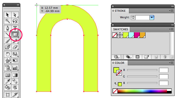
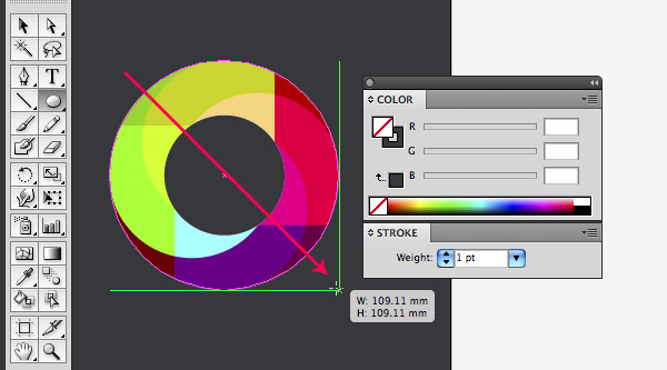
Now let’s create a 4xU shaped icon. Select the Ellipse Tool and draw a circle (around the size of 3.8 inch). Give the circle a stroke of 96 pt, and apply the bright green swatch as a stroke color. Give the circle no fill.
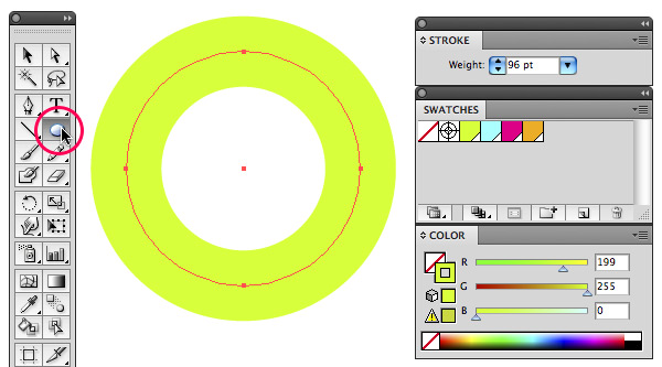
Step 3
Grab the Direct Selection Tool (white arrow) and select the bottom anchor point of the circle. Hit the Delete key to delete the bottom half of the circle.
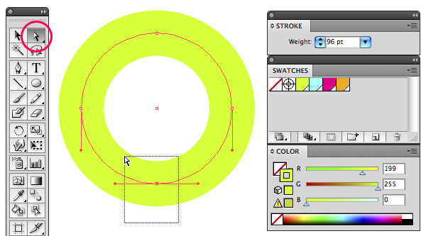
Step 4
Turn on Smart Guides (View > Smart Guides or Command + U). Select the Pen Tool and and click On the left anchor point of the circle to continue the path segment. Hold down the Shift key and click again somewhere further down below as shown in the image below.
Hold down the Command key and click on the white background of your canvas to end this path. Now click in the other anchor point of the circle, hold down Shift and click again further down below on the same height of the other line you’ve just drawn. With Smart Guides turned on you should see an intersection of two guides.
Step 5
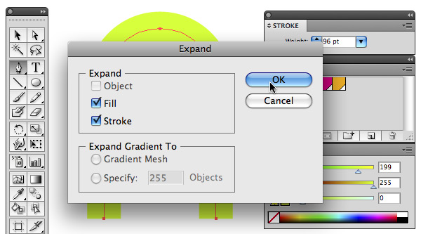
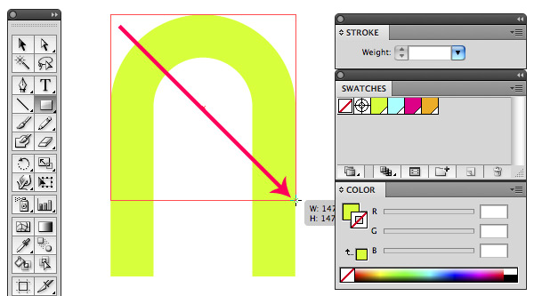
Grab the Selection Tool and use it to select the entire object. Go to Object > Expand. Make sure Fill and Stroke are checked. Click OK.
Step 6
Select the Rectangle Tool and drag a square around the object, starting at the Smart Guides’ intersection point in the top-left corner as shown.
Step 7
Hold down the Shift key and drag diagonally, from the top-left to the bottom-right, to draw a square.
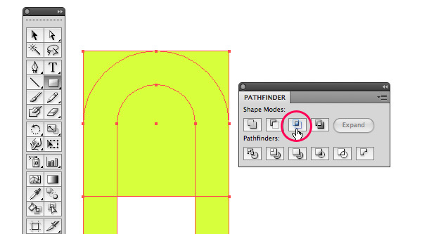
Step 8
Select both objects using the Selection Tool and go to the Pathfinder palette (to reveal this palette, go to Window > Pathfinder or hit Command + Shift + F9) and choose the Intersect option.
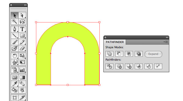
Step 9
You should end up with this result (see image below).
Step 10
Now comes a bit of a tricky part…
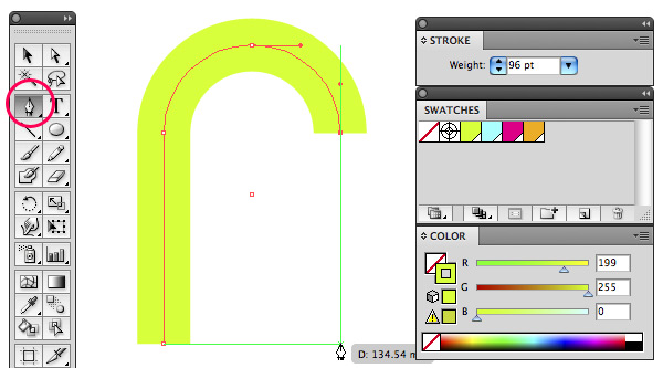
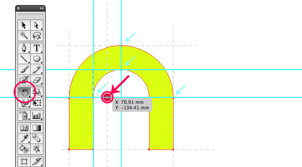
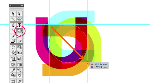
The red dot (shown in the image below) will be our rotation point for the next step. Drag guides to help you define this position. Start by dragging two horizontal and two vertical guides so you en up with four intersections that form a square as shown.
Draw this square on top of the guides using the Rectangle Tool, while holding down the Shift key. With the square still selected, drag another vertical guide onto the center point of the square. Now delete the square. The intersection point of this vertical guide where it meets the bottom horizontal guide is your rotation point.
Step 11
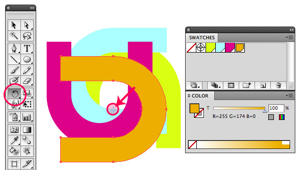
Select the Rotate Tool, hold down the Option key and click precisely on the intersection point. In the Rotate dialogue box enter the value of 90 degrees and click Copy. Now hit Command + D (Object > Transform > Transform Again) two times in a row to repeat this action twice.
Give each object a different color fill, applying the swatches you’ve prepared at the beginning of this tutorial: blue, hot pink, and orange.
Step 12
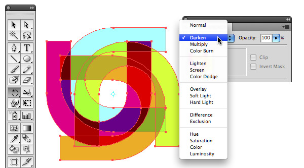
Select all four object using the Selection Tool. Go to the Transparency palette (to reveal this palette, go to Window > Transparency or hit Command + Shift + F10) and select Darken from the dropdown menu. Group the four objects (go to Object > Group or simply hit Command + G).
Step 13
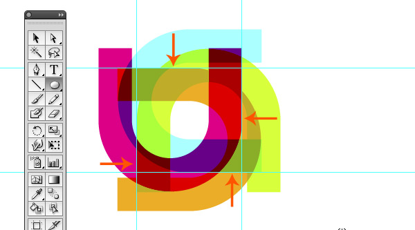
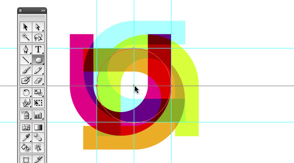
Drag two horizontal and two vertical guides as shown in the image below. The four intersection points should result in a square.
Step 14
Select the Ellipse Tool and draw a circle. Click in the top left intersection point and drag towards the bottom right intersection point while holding down the Shift key. Give the circle a thin white border and no fill.
Step 15
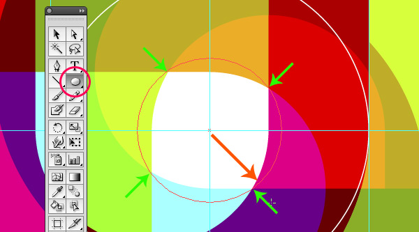
Draw a small circle on top of this circle starting from the center point out as shown. Again, hold down the Shift key while you drag.
Step 16
Stop dragging and release the mouse exactly at the four intersection points as shown. Select both circles and turn them into a compound path. Go to Object > Compound Path > Make, or simply hit Command + 8.
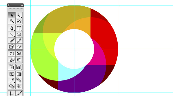
You don’t actually see the result of this since the circles don’t have a fill, but if you give the object a fill, you’ll see that you’ve created a hole and that you now have a ring shape. We’ll be applying this shape as a mask.
Step 17
Select both the grouped object and the ring shape and go to Object > Clipping Mask > Make, or simply hit Command + 7. Give the layer a name, something like “4xU” for example.
Step 18
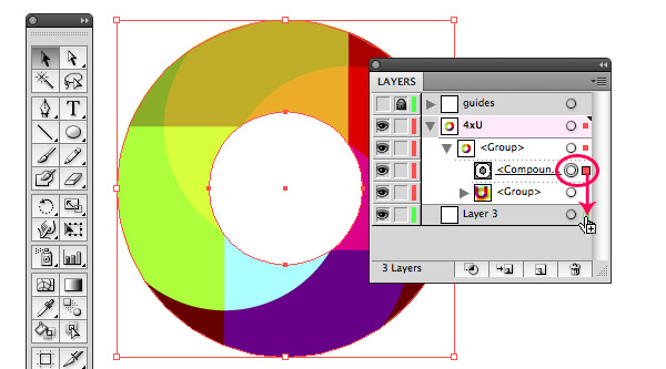
Create a new layer in the Layers palette by clicking the Create New Layer icon at the bottom of the palette (to reveal this palette go to Window > Layers or hit F7). Make sure the new layer sits below the layer holding the four objects. Drag the layer below it.
Now click the triangle in the “4xU” layer to reveal all sublayers. Click the circle shaped target icon on the right of the sublayer that is called “Compound Path” to select all the objects of this sublayer. Hold down the Alt key while dragging the content of this sublayer onto the new layer below it. Holding down the Alt key duplicates the content while dragging, which is what we need.
Remember, we’ve applied a Darken transparency mode to our “4xU” object. This means that as soon as we move this object onto a dark background, the colors will change; the effect and outcome will be totally different. To make sure we maintain this exact result, we need to add a white background below this object.
Step 19
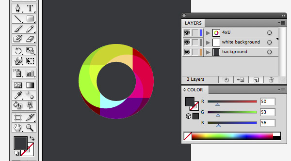
Give the layer a name of “white background” and add a new layer below. Call this layer “background.” Select the Rectangle Tool and draw a rectangle that matches the document’s size. Give the rectangle a dark fill by using our dark gray swatch (R=50, G=53, and B=565).
Now select the “4xU” object and the “white background.” In the toolbar at the top (to reveal this, go to Window > Control), select Align To Artboard from the dropdown menu (left to the align option). Select the Horizontally Align Center option and then the Vertically Align Center option from the align options in the toolbar.
Step 20
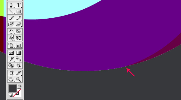
Now when you zoom in very big, you’ll notice some irregularities. To hide these, we’ll add a circle that matches our shape and give it a 1pt stroke, the same color as the background.
Step 21
Select the Ellipse Tool and find the intersection point using Smart Guides (Command + U to switch Smart Guides on and off) as shown.
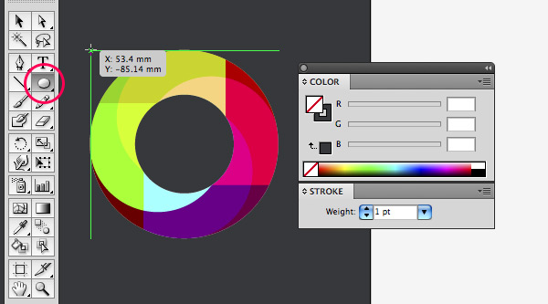
Step 22
With Smart Guides turned on it should be easy to draw a circle that matches our ring shape. Don’t forget to hold down the Shift key while dragging.
Step 23
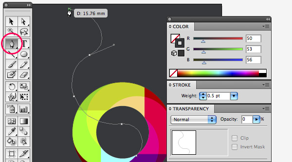
Now let’s create smoky lines using the Blend Tool. Create a new layer that resides right above the background layer. Select the Pen Tool and draw a very curvy upwards line as shown. Give the line a 0.5pt stroke that is the same color as our background. Go to the Transparency palette and give the line 0 Opacity.
Step 24
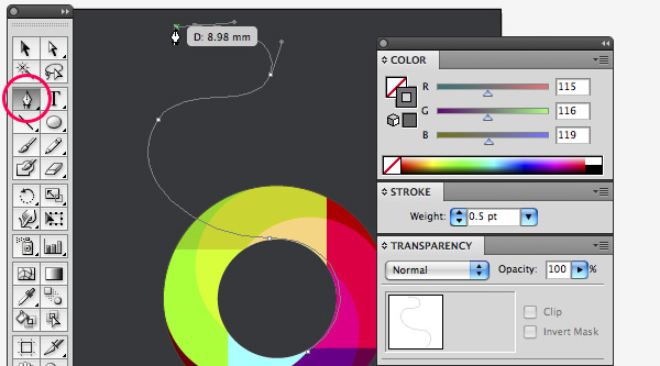
Draw a second curvy line and make sure you intersect the previous line twice. Give the line a 0.5 pt stroke using a gray of R=1154, G=116, and B=119.
Step 25
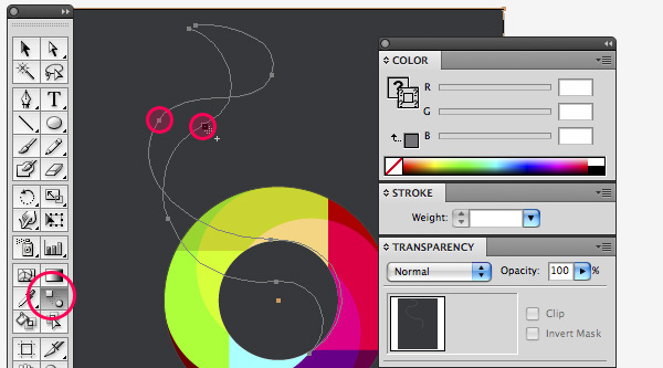
Select both lines using the Selection Tool. Select the Blend Tool from the toolbox and click once on an anchor point of one of the lines, now hold down the Alt key and click on one of the anchor points of the other line close by as shown. In the Blend options dialogue box, choose Specified Steps from the dropdown menu, choose Align To Path (second option) as orientation, and enter a value of 200 steps.
Step 26
You should get a result as shown in the image below.

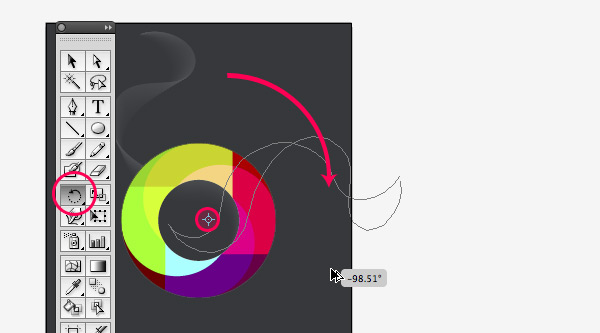
Step 27
Select this smoky blend object and grab the Rotate Tool in the toolbox. Click somewhere in the “4xU” ring, hold down Alt key so you duplicate the object while you drag as shown in the image below to rotate the object.
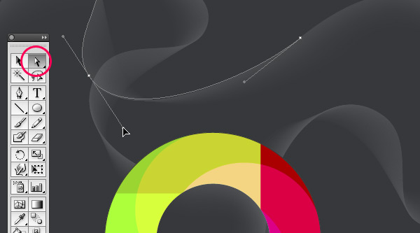
Step 28
Select this new duplicated object and copy and paste it. Move it towards the top of the page. Grab the Reflect Tool and mirror the object horizontally. Grab the Direct Selection Tool, select an anchor point on one of the lines. Drag the bezier handles to modify the curve so you’ll end up with a different smoky line to make things look more random. Repeat this step if needed one more time until you have some nice smoky effect.
Step 29
Now we’ll work on applying some finishing touches, using the opacity masking technique. Let’s make a glowing circle. This finishing touch uses some more advanced techniques and also requires version CS4.
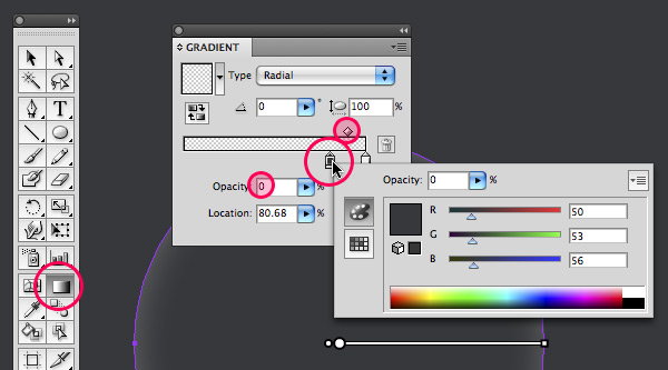
Create a new layer below the “white background” layer and call it “glowing circle.” Select the Ellipse Tool and draw a circle (holding down the Shift key while dragging) that is slightly bigger than the “4xU” ring object. Make sure the circle is perfectly center aligned with the “4xU” icon. Turn off visibility of the “4xU” layer and “white background” layer (eye icon) for now. Fill the circle with a radial gradient going from white with 15% Opacity to the color of our background with 0% Opacity at a location of 80.68, as shown in the image below.
Step 30
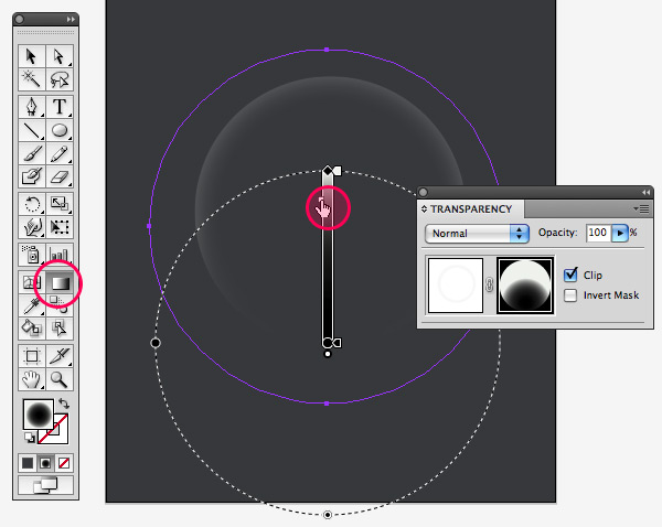
Select the Ellipse Tool again and draw a circle on top of this circle. Give the circle a default white to black radial gradient. Click the Reverse Gradient option in the Gradient palette (to reveal this palette, go to Window > Gradient or hit Command + F9) so you end up with black in the center of the circle going to white.
Now select both circles and go to the Transparency palette (to reveal this palette, go to Window > Transparency or hit Command + Shift + F10). Select Make Opacity Mask from the palette’s dropdown menu (arrow on the top-right of the palette). Click the mask icon in the Transparency palette (on the right of the link icon). Select the Gradient Tool from the toolbox and adjust the location of the Gradient Slider as shown.
Step 31
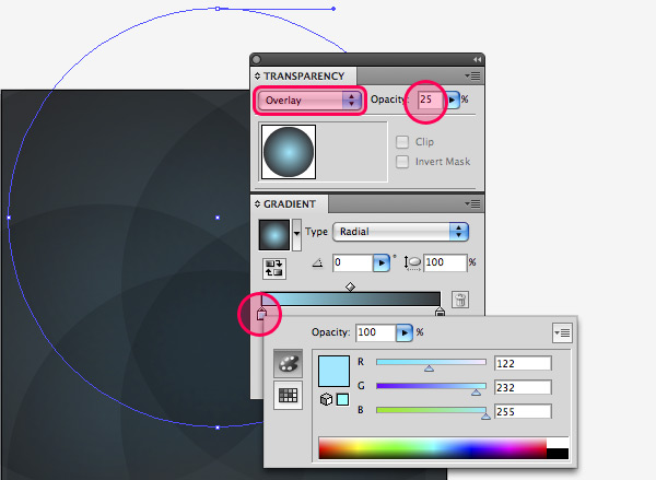
Now we’ll create a subtle spirograph background effect.
Create a new layer right above the “glowing circle” layer. Select the Ellipse Tool and draw a very big circle almost double the size of the “4xU” object (holding down the Shift key while dragging). Give the circle a radial gradient fill going from a light blue (R=122, G=232, and B=255) to the color of our background (R=50, G=53, and B=56). Go to the Transparency palette and choose Overlay and a value of 25% Opacity.
Select the Rotate Tool from the toolbox. Hold down the Alt key and click somewhere in between the center point and bottom anchor point of the circle. Enter a value of 60° and click Copy. Now hit Command + D four times in a row. Group all the circles. Select the Rectangle Tool from the toolbox and draw a rectangle matching the artboard’s size. Give this rectangle the same black to white radial gradient fill as the glowing circle. Select both the spirograph and rectangle, then go to the Transparency palette and select Make Opacity Mask again from the palette’s dropdown menu. Click the mask icon in the Transparency palette, select the rectangle, and select the Gradient tool. Edit the gradient if needed.
Conclusion
The final design is below. The font used in this poster is Neutraface. Have fun applying these techniques in your own work!
Enjoyed this Post?
Subscribe to our RSS Feed, Follow us on Twitter or simply recommend us to friends and colleagues!
By Veerle Pieters
Join our newsletter!
Create a Tutorial, Get Paid!
Have something to teach the world? Want to earn money doing it? Tutorials, screencasts, and articles published here on Vectortuts+ are largely contributed by readers just like you! We'll pay you great money for good content. Find Out More
simple n cool!
Nice tut. Loved the colors and smoke effect.
Great masking tips and nice effects indeed, thx for sharing.
Vraiment très joli, simple mais stylé.
Good job. thanks
Really great, thanks!
nice…
Great tuts!
Reaally cool friend!!! thanks for inspiration ;)
Nice technique. I like the smoke behind the logo :)!
Terra´s Logo
http://www.terra.com.br
Learned some good tips and techniques. Great tut.
Some small typos though! :P
Also, you may want to mention to clear guides before doing the new ones on step 10
As I mentioned on another post, this will help as I’ve recently started uploading files to Graphic River. I’ve seen a recent trend in web backgrounds, and posters can easily be made into backgrounds.
@Name Name aka coward, you come to the right place to learn here as you clearly are in need to learn to differentiate shapes ;) I suggest getting the $9 subscription :)
@David: Thanks for spotting but you should have mailed the editor though as that would have been more helpful instead of posting here ;)
Hey Veerle, thanks for making a tutorial for our site. I love the results and it’s an interesting workflow. I’m a big fan of your work – for many years.
Any of you unfamiliar with Veerle’s work, it’s always crisp, fresh, and professional. She’s been blogging and making Illustrator tutorials (among other tutorials) for years.
She’s influenced many graphic designers and web designers. Her blog has a bunch of great tutorials on it, and the design of the blog itself was groundbreaking when it first came out, and is still unique today. Here is the link http://veerle.duoh.com/ and thx.
Veerle’s illustrator tutorials are by far the best I’ve found on the web. Thanks for sharing some of your techniques with us.
This is great and easy to follow. Thanks!
wow im kinda flashed that veerle pieters (!) wrote a tut for this site ;)
Great tutorial – I’m always amazed at the way you come up with unique designs and it inspires me to play around with shapes and geometry in Illustrator.
In working through the above steps, I believe the stroke in #23 should have opacity set to 0, not the stroke drawn in #24. It’s not a big deal, but if done exactly as specified, the smoky shape ends up with a dark grey line running through it. But I’m using CS2 – maybe the behavior is different.
@ballookey – Thanks for the edits. I got those fixed.
I always learn more about Smart Guides when I read one of Veerle’s tuts. THanks!
Great to hear people love the tutorial and learn a few new things. Makes it always very worthwhile writing it.
@Sean Hodge Thank you for the kind words. You are welcome :)
@ballookey You are right it should be 100% opacity, not 0. The image shows it right but it’s wrong in the text I see. Thank you for spotting this.
thanks for your tut… at step 8 i had to choose “crop” instead of “intersect shape areas” also worked fine…
greetings
Fun tutorial!
Veerle, something changes between step 18 and 19. The colors are supposed to remain the same (because we put them on a white background to ensure that), but YOUR colors change. You can best tell by looking at the orange in 18 and then in 19. Did you change fill colors or are you playing with a different transparency mode? Seems like 19 is a bit lighter and less saturated.
GOOD POINT! I noticed it after I ended up and I thought that maybe color mode is different or something but it CHANGES in the tutorial! Who can explain it?
I’ve been a fan of both Veerle and tuts+ for sometime now and it’s nice to see both working together. Thanks to both.
I love Veerle… her work is just AMAZING!
Wow! Finally, Veerle is in the House!
We all love her style (… and her accent) I saw a couple of video tutorials on the net, and she sounds so sexy!
Well, let Veerle tuts keep coming!
what the hell? this is so hard!
Yeah , I love Veerle’s tutorial too! I’ve been visiting her blog for quite sometime now.
I really like this tutorial but i think i am having ‘a bit of a moment’. I have my layers aligned like so:
Cirle – group
compound clipping path
group (this is the shapes themselves
layer 2
compound clipping path
white path
layer 3
black
unless i am mistaken this is correct and yet i can’t get the black to come through at all – it is as if the clipping path in layer 2 does not work.
Any ideas guys?
got it – only took ages! cropped the white background layer with the layer 2 clipping path so the only bit of white is where the circle is.
Great tut. Nice end result.
Skills… I really respect such designs. Great job, keep workin’
Nice .. I’ll try it tonight
Thanks
great….
Okay, I need help. For the life of me I’m stuck at steps 18 & 19. I don’t see how I need to get the white path mentioned by danfish. Please help!
I always love seeing Veerle’s tutorials, always so sharp, clean, colorful and definitely beautiful! It would be an honor to one day meet you in person :)
Voted for Obama, did ya?
I hope not…
Now this is really nice. And useful too. This is pure Vector bliss. My association with the print media naturally excites me whenever I see something good designed is vectors. Thanks for the post.
very nice!thank you!
I tried this tutorial over and over and found that your measurements were off, sorry. You might want to double check that. Your “D” values and “Y and “X” values did not work out for me. Great tutoriial though, great colors and awesome way of doing it.
Hail Veerle and all that is vector – not enough of this kinda stuff out there!
Anyone that has not checked out her personal site should NOW …
http://veerle.duoh.com/
If only just to hear her speak!
Would have liked to have seen the beautiful lines of the curves making the outline of the ultimate shape rather than the cheap crop. Although IMHO the smoke tut was worth the admission price on it’s own!
Fantastic chaps – Deano
I’m stuck on step 10.. I don’t know how to make these ‘guides’?! if anyone could elaborate that would be appreciated!
thanx
For some reason I had a problem producing the (crop) circle using the initial dimensions provided so I scaled up your Step 2 image to 3.8″ diameter and found the stroke to be more like 82Pt. This seemed to resolve my problem.
I’ve just got to get my head around Steps 18 & 19 now. I’m new to Illustrator so it’s probably taking me longer than it should but really enjoying the tutorial.
Loving your work Veerle and your excellent blog.
Keep up the good work. You’re a star. x
Ref Steps 18 / 19
I think I’ve cracked it. Just apply a white fill to the new compound mask. Seems to work.
bad spelling mistakes.
(Select the Pen Tool and and click On the left anchor point.)
2 and’s…why??!?
(two vertical guides so you en up with four)
so you en up with!?
I also had a big problem trying to figure out step 18, the white background. The tutorial was poorly written here, and some other spots. I resorting to referring to Veerlie as “that b___” quite a few times until I figured it out. Sorry but that’s the truth!
After you do the transfer of the compound path to the second layer, then select the second layer compound path, then click on the fill in the toolbar, choose white and you’ve got it.
Thanks for the tuts
I found you can pull this off without having CS4 for the glowing background circles:
Do the gradient as normal with the white and gray at the same location, then copy and paste in front the same circle with the gradient but switch the gray to black in the gradient. Then select both circles and go to Transparency>Make opacity mask. Then, select the Opacity mask object in the Layers menu and change the transparency down to 15%.
Hope that helps people with CS2/3. Not sure if this can be done in CS or older.
I’m stuck at step 18/19. I don’t get it right and I tried for half an hour now. The circle is fading away in the dark grey or I can’t see the dark grey at all (white background+circle). :( Help, please! :)
I’ve taken a quick look at the previous question/answers and Paul said that he knows the answer…
“I think I’ve cracked it. Just apply a white fill to the new compound mask. Seems to work.”
Let me know if this helps, I’ll see if I can figure it out for you.
Ok, I’ve had a look at the file – select the compound path and apply a white fill – you can get to the compound path by opening the layers and popping open the mask group, you’ll see it in there, make a copy and move it under your shapes and fill it with white.
I think this is what you need to do. :)
thanks for this tut :)
Very nice thanks!
Everything goes along beautifully until step 30. I’ve followed your example multiple times–to the letter–and I can’t get the opacity mask to behave properly. I’m using CS5. Are there any known issues? Thanks.
thanks for the tuts